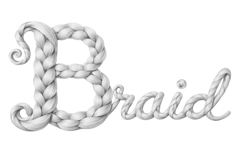
Braid is a beauty-tech platform for stylists and the people they style. The system below carries the brand's two non-negotiables — editorial polish and operational clarity — into every token, surface, and component. Each section opens with a designer's note that explains how the choice shapes the language.
01
Typography
3 families · 10-step scale
Designer's note
Gyst carries the brand voice in headlines, Roboto handles every operational moment with neutral clarity, and Inter takes the precise small work — three voices, each with one clear job, so the page never speaks over itself.
Font families
Gyst Variable
Display / Brand
Bold
Hair Care Curated
Licensed display font. All major headings, section labels (POSTS, COURSES), and hero copy. Bold weight only.
Compact UI elements: ratings, timestamps, small annotations, hex codes.
Type scale
Style
Size / Weight
Example
Display XLGyst Variable
42 px Bold
Hero & page titles
Price DisplayRoboto
30 px Regular
Product pricing
Section TitleGyst Variable
20 px Bold
SECTION LABELS
Product NameRoboto
21 px Regular
Product & article headings
Button / CTARoboto
18 px Regular
Profile nav buttons
BodyRoboto
16 px Regular
Nav labels, standard body copy
CaptionRoboto
14 px Regular
Sub-labels, secondary descriptions
Small / MetaRoboto
12 px Regular
Remaining time, micro labels
MicroInter
10 px Medium
Ratings · Timestamps · Tiny annotations
System BarSF Pro Text*
12 px Medium
macOS / iOS system chrome
02
Color
curated palette · dark-first
Designer's note
Lavender lifts and Deep Violet anchors — two accents give the system a clear emotional spectrum where light moments feel buoyant and dark moments feel intentional, without diluting either.
Backgrounds
Deep Indigo
#18172C
Primary page background
Jet Black
#171717
NavBar, cards, close buttons
Rich Navy Purple
#24213C
Sticky headers, tab bars
Medium Purple
#382A4D
Sections, panel cards
Dark Purple
#221E3C
Badge & pill backgrounds
Dark Charcoal
#1F1F22
Toggle base, input fields
Text
Pure White
#FFFEFE
Primary headings & body
Soft White
#EFEFEF
Active nav labels
Warm Gray
#C8BFBD
Muted / inactive text
White 90%
rgba(255,255,255,0.90)
System bar text
White 70%
rgba(255,255,255,0.70)
Secondary product info
White 60%
rgba(255,255,255,0.60)
Tertiary labels, prices
Purple accents
Lavender
#C8BCF6
Light accent — icons, highlights, soft text
Deep Violet
#5A199B
Dark anchor — emphasis, CTA fill, gradients
Warm accents
Amber Orange
#FF9033
Progress bars, CTA highlights
Gold
#FFBF00
Star / badge glow
03
Gradients
7 named blends
Designer's note
Gradients are where Braid's beauty lives — they carry the warmth and sheen that flat color cannot, and each blend is tied to a specific surface so the language stays unmistakable at a glance.
Page Fade
radial · #2A2350 → #18172C → #100F22
Purple Pop
135° · #C8BCF6 → #5A199B
Orchid Bloom
140° · #EBC8FE → #CAA8E9 → #624884
Border Nebula
135° · #C8BCF6 → #624884 → #5A199B
Deep Dusk
180° · #382A4D → #221E3C → #18172C
Violet Sterling
135° · #A7A4DF → #5A199B
Warm Flare
135° · #FFBF00 → #FF9033
04
Spacing & Radius
4px base · 3 radius steps
Designer's note
Small for inputs, large for cards, pill for anything that invites action — three radii give Braid a consistent silhouette so the product reads the same on a phone, a tablet, and a poster.
Spacing scale
--space-1
4 px
--space-2
8 px
--space-3
12 px
--space-4
16 px
--space-5
20 px
--space-6
24 px
--space-7
32 px
--space-8
40 px
--space-9
48 px
--space-10
64 px
--space-11
80 px
--space-12
96 px
Border radius
SM
12 px
Inputs · badges · small cards · media
LG
20 px
Cards · panels · hero modules
PILL
999 px
Buttons · toggles · tabs
05
Elevation
5 shadows + 2 glows
Designer's note
Neutral shadows carry hierarchy quietly; violet and amber glows mark the two things Braid wants users to feel — action and momentum — so attention always lands where the brand asks for it.
Shadow XS
subtle separation
Shadow SM
card resting
Shadow MD
interactive lift
Shadow LG
modal · popover
Shadow XL
overlay · drawer
Glow Violet
primary CTA
Glow Warm
progress · highlight
06
Glass Surfaces
glossy · reflective sheen
Designer's note
Glossy glass mirrors the polish of the category — sheen, reflection, and shine are visual cues Braid users already recognize from product packaging, salon mirrors, and finished hair.
Default
Glossy & clean
Light blur with a top-to-bottom sheen and a bright inset highlight — reads as polished glass, not frost.
.glassLifted
Stronger reflection
Brighter sheen and a sharper border — use for hover states, focused cards, or surfaces meant to read as foreground.
.glass--liftedBranded
Lavender-tinted
Lavender sheen over a violet base — reserved for hero modules and premium surfaces.
.glass--violet
07
Components
core building blocks
Designer's note
Buttons, badges, inputs, and tabs all share the same visual grammar — rounded silhouettes, lavender highlights, soft glass — so the system reads as one product, never assembled parts.
Buttons
Primary actions
Secondary & alternate
Icon & state
Sizes
Badges
NewFeaturedHot★ 4.9Draft
Input
Tabs & toggle
Off / On
Progress
Module 4 of 664% complete
08
Patterns
tokens in context
Designer's note
Cards are where the brand meets the user — gloss, gradients, and type hierarchy come together to show how the tokens add up to a feeling, not just a screen.
4.9
Intex Loc Re-Twist Kit
Style Kit · 30 min · Pro
$300.00
BestsellerIn stock
Featured course
4.9
Intro to Loc Re-Twist
A beginner-friendly course teaching the foundations of locking, refreshing, and finishing.
MJ
Maya Johnson
Master Stylist · 1.2k students
Module 2 of 632%
6 modules
1h 20m
09
Responsive Cards
desktop · tablet · mobile
Designer's note
Cards collapse gracefully because spacing, type, and surfaces all stay token-driven — Braid's silhouette holds from phone to desktop without bespoke layouts for any size.
Desktop1280+
4.9
Loc Re-Twist Kit
30 min · Pro
$300
Bestseller
Course 4.9
Intro to Loc Re-Twist
MJ
Maya Johnson
1.2k students
Module 2 of 632%
6 modules
Tablet768
Loc Re-Twist Kit
30 min · Pro
$300
Bestseller
Course★ 4.9
Intro to Loc Re-Twist
MJ
Maya Johnson
Master Stylist
6 modules
Instructor
MJ
Maya Johnson
15+ Year Loctician
Certificates
Completion
C1.1
Re-Twist Kit
Overview
A beginner-friendly course teaching the foundations of loc re-twisting from Maya Johnson.
C
C
C
+100 chatting
375 · iPhone · Bento
10
Bento Layout
composed course page
Designer's note
Bento boxes let one screen carry many signals at once — instructor, certificate, social proof, overview, CTA — without competing for attention, because every tile speaks in the same glass-and-gradient vocabulary.
Instructor
MJ
Maya Johnson
15+ Year Loctician
Certificates You Can Earn
Certificate of Completion
Loc Re-Twist · Level 1
C1.1 BEGINNER
Certificate of Completion
Loc Re-Twist · Level 2
C1.2 INTERMEDIATE
C
C
C
and 100+ others are chatting
Overview
This beginner-friendly course is designed to introduce you to the fundamentals of loc re-twisting. You will learn the foundations of locking, refreshing, and finishing — straight from Maya Johnson, with a focus on building confidence at every stage.